“Slow Down & Simplify” Letterpress Edition
These hand-set letterpress prints were inspired by advice given by guitar instructor Rob Hampton of Heartwoodguitar.com in the context of learning to play the guitar. But, I thought it it seemed apt for just about any endeavor, and would make a good subject for some letterpress experimentation.
I haven’t really worked with hand-setting type since taking Print Shop in Jr High, and we had just a few hours in the shop, so I wanted to pick something typographically simple and play with variations in inking. In the end I ended up with 13. And, somewhat ironically, though my theme was ‘slow down & simplify’ at the time the process felt like ‘hurry up and complexificate’ as I kept trying different color combinations!
This is a ‘limited edition’ in that the type was set and prints were made, and then the type returned to the drawers. There won’t be any more exactly like this! The prints are all 11×17”, either on heavy white paper or brownish chip board. The “Slow Down” text is vintage hand carved wooden type, the “&” is brand-new wood type that I believe was CNC cut. The “simplify” is vintage metal type. The ink colors we had available were a luscious deep red, a dark blue, a medium-dark green, and fluorescent orange. The posters were hand-set, inked, and printed by me at Compound Studios in Emeryville, California, in August 2024.
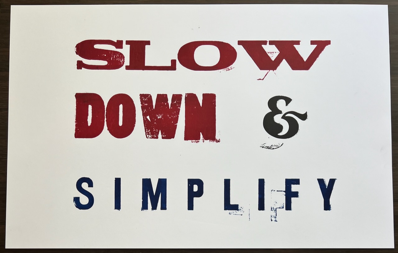
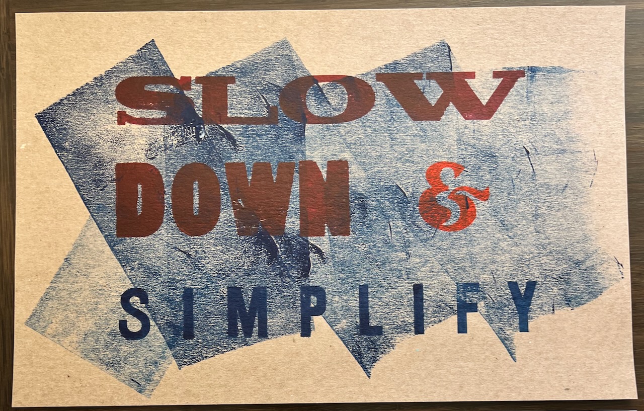
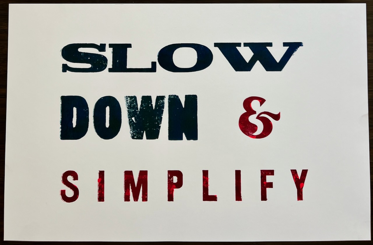
Print #1 of 13: Red and blue on white paper.
I didn’t have my technique down with this first image, so it’s got some ghosting on it. I must’ve shifted the paper a bit when I was first putting it down on the inked type. I thought it looked kinda cool, though, so kept it in the edition.
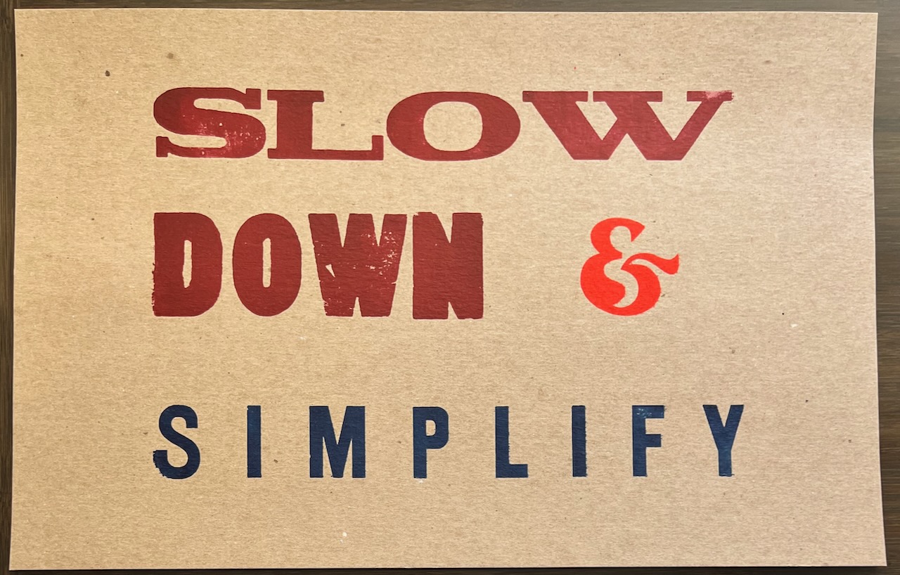
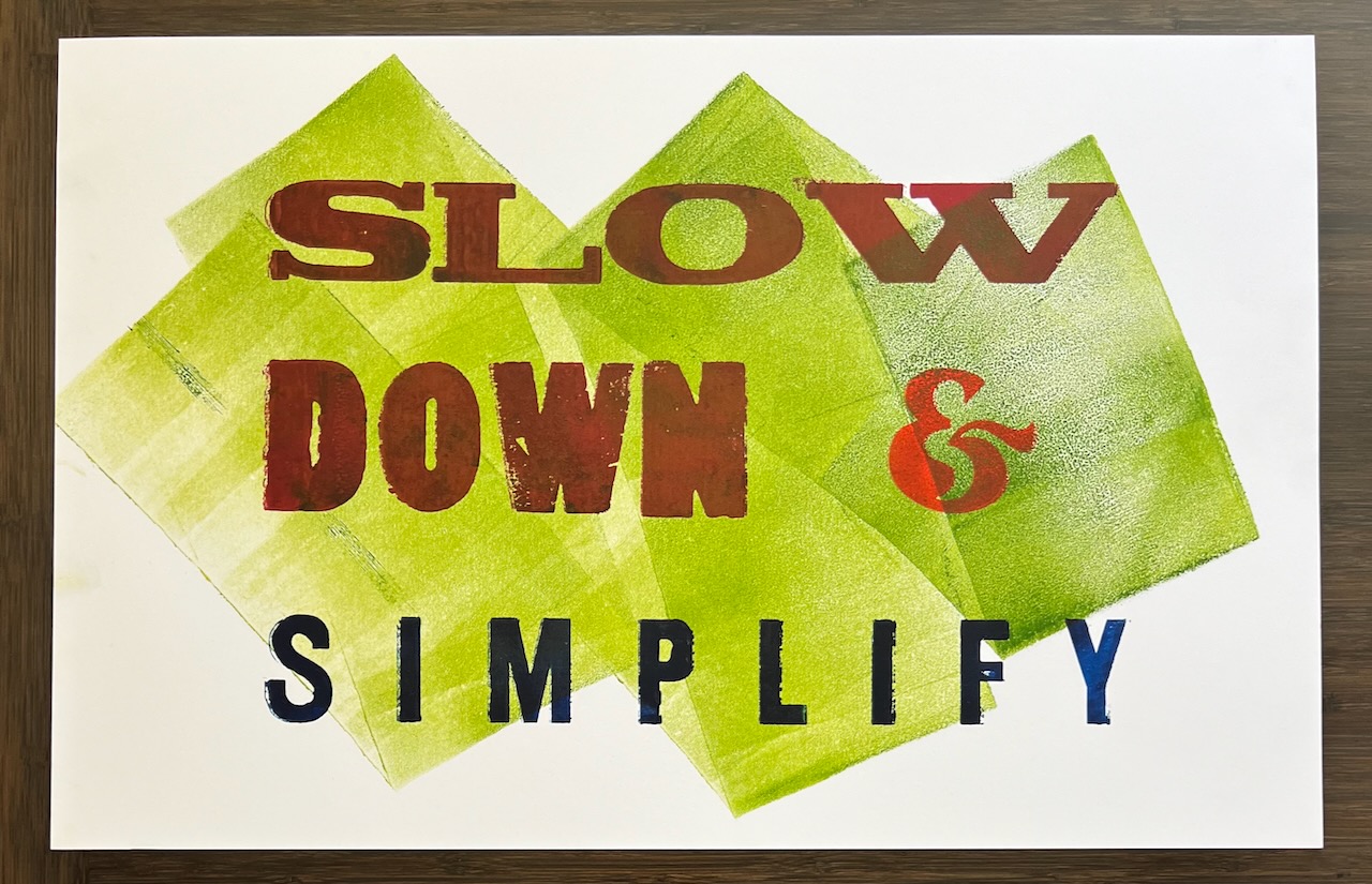
Print #2 of 13: Red, orange, and blue, on chipboard.
When I pulled this one I decided that the leading (space between lines of type) between the “Down &” and “Simplify” was too big, so I unlocked the type and reset the space to be a bit slimmer for all the subsequent prints.
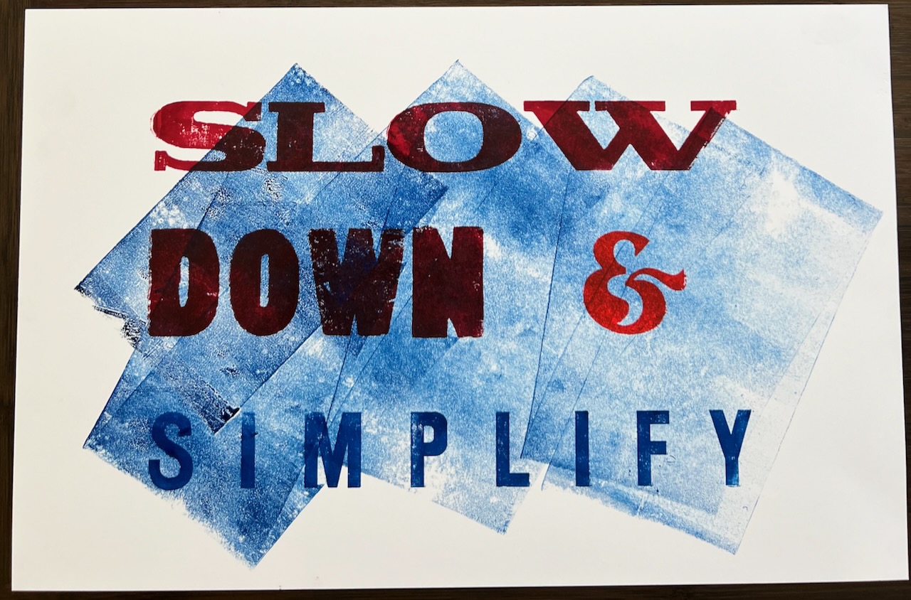
Print #3 of 13: Red, orange, and blue, with blue ink background, on chipboard.
Print #4 of 13: Red, orange, and blue, with blue ink background, on white paper.
Print #5 of 13: Red, orange, and green, with blue ink background, on chipboard.
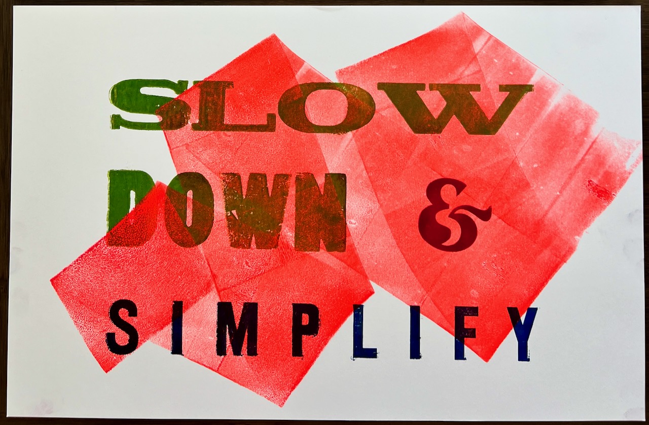
Print #6 of 13: Green, red, and blue, on orange inked background, on white paper.
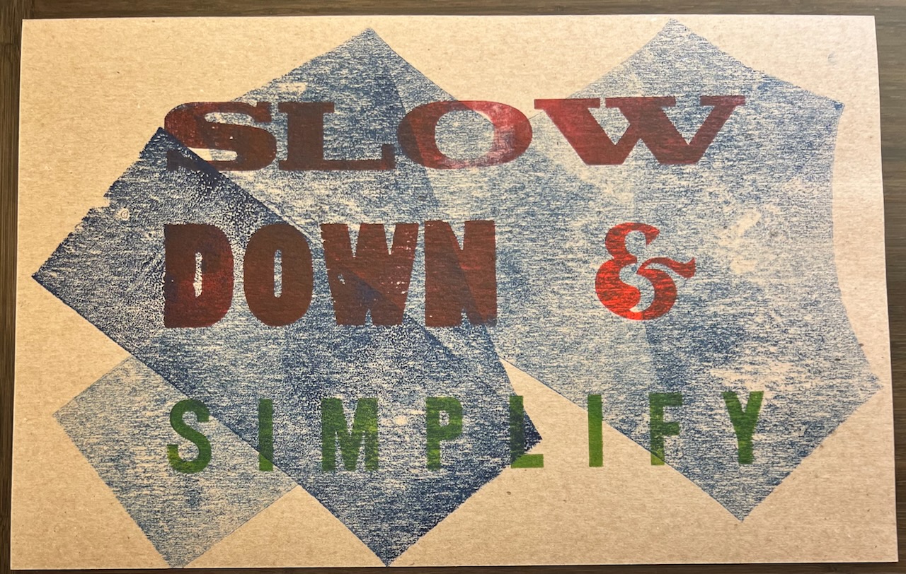
Print #7 of 13: Red, orange, and blue, on green inked background, on chipboard.
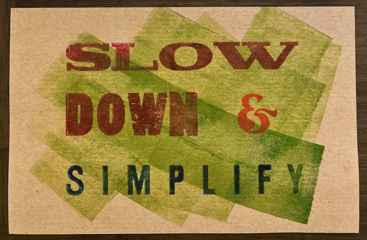
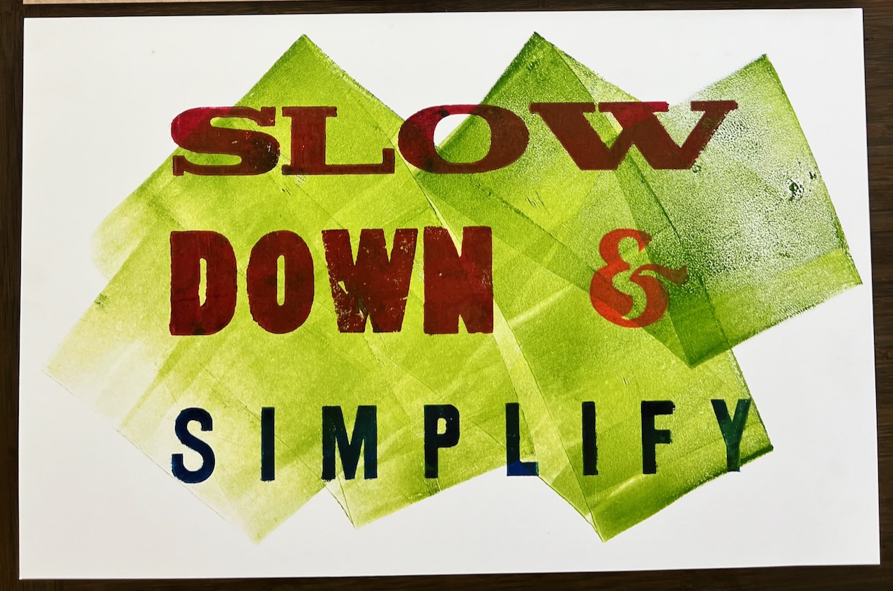
Print #8 of 13: Red, orange, and blue, on green inked background, on white paper.
Not available.
Print #9 of 13: Red, orange, and blue, on green inked background, on white paper.
Not available.
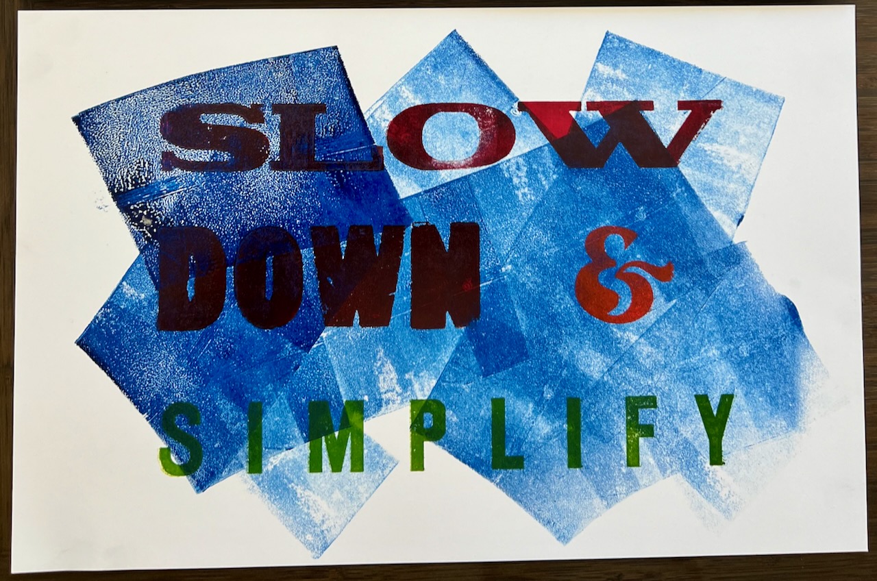
Print #10 of 13: Red, orange, and green, on blue inked background, on white paper.
Print #11 of 13: Blue, and red flecked with orange, on white paper.
Print #12 of 13: Green, and red flecked with orange, with blue inked background on white paper.
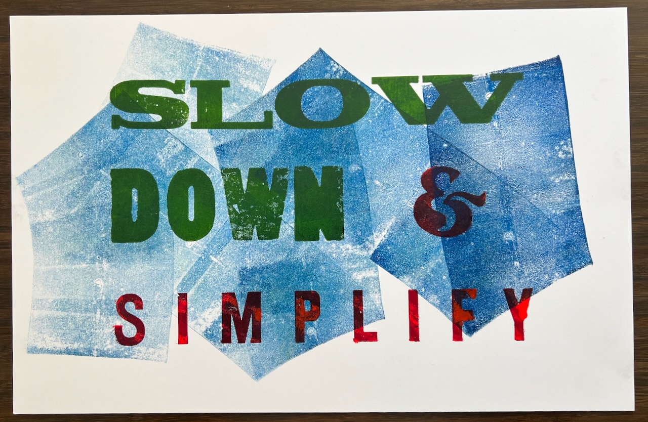
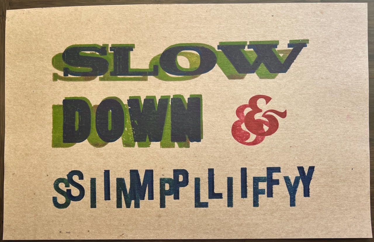
Print #13 of 13: Multiple impression experimentation.
The drop-shadow effect was created by doing multiple impressions on the same paper: On the first two impressions, initially the ‘Slow Down’ text was first inked with green, printed, and then the paper was pulled and then shifted up and to the right for the second impression. Then re-inked with blue, for the third impression. Both the ampersand and the word ‘simplify’ were part of the first two impressions, then masked off for the third. I would have liked to have done more attempts at this technique to refine it, but I ran out of time.